

A simplistic approach to typography is essential when you want to achieve a clean an minimalist style in design. The main idea of minimalism is driven by the idea that less is more, so it should be no surprise that fonts and typographic elements are stripped down to only the essential elements. The trends are indicating that people prefer minimalist designs when it comes to houses, IT products and interfaces that are less crowded. This is the future.
Minimalism got its start as a design movement in the early 20th century and had a surge of popularity in the 1960s. Along the way, its influence found its way into many design fields, from architecture and furniture to movie making and print design. Now, minimalism has made a comeback (or another upswing in popularity), and you may notice that many of the designs you see or interact with on a daily basis have been influenced by minimalism on large scale: just think of Apple’s products and packaging and Google’s branding. On a smaller scale, designers all over the world tend to keep the same directions: Hibridium‘s logo portfolio is a good example of minimal fonts usage in logo design concepts.
Minimal fonts, maximum effort
Minimal fonts look great on many design projects like: furniture, web tools, websites, posters, banners, logos and many many more. However, to build a design that is indeed minimalist is not simple at all. Less is more, but it is also hours of research, dozens of drafts and sketches, and many many hours of research. So choosing the right font could mean combing through hundred of thousands of variants and choices.
Minimal Characteristics
If you do decide on a minimal approach, here are the must-have of the fonts, in order to showcase your concept as it should:
- Geometric Shapes: this will mostly come into play in how the letters are formed
- Clean lines
- Crisp edges
- Open or Airy appearance: created by white space within or between letters
- Design details that have significance or purpose: don’t let anything be there just because it is there.
- Good Legibility: usually this means easily identifiable letter shapes, moderately tall lowercase letters and larger letters overall
- Visual impact: this could be in the design of a typeface or in how you as a designer apply the font
All this being said, and without any further ado, the top 10 handpicked minimal fonts for 2020:
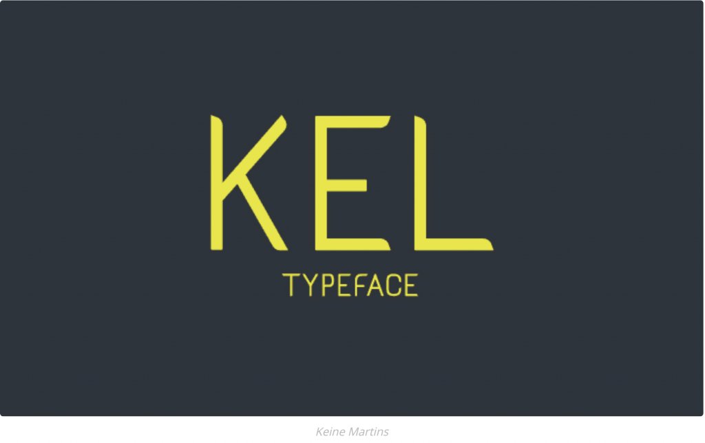
1. Kel by Keine Martins (get it here)
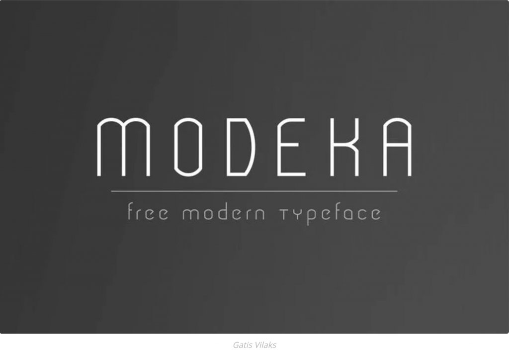
2. Modeka by Gatis Vilaks (get it here)
3. Panama Light by Adrien Coquet (get it here)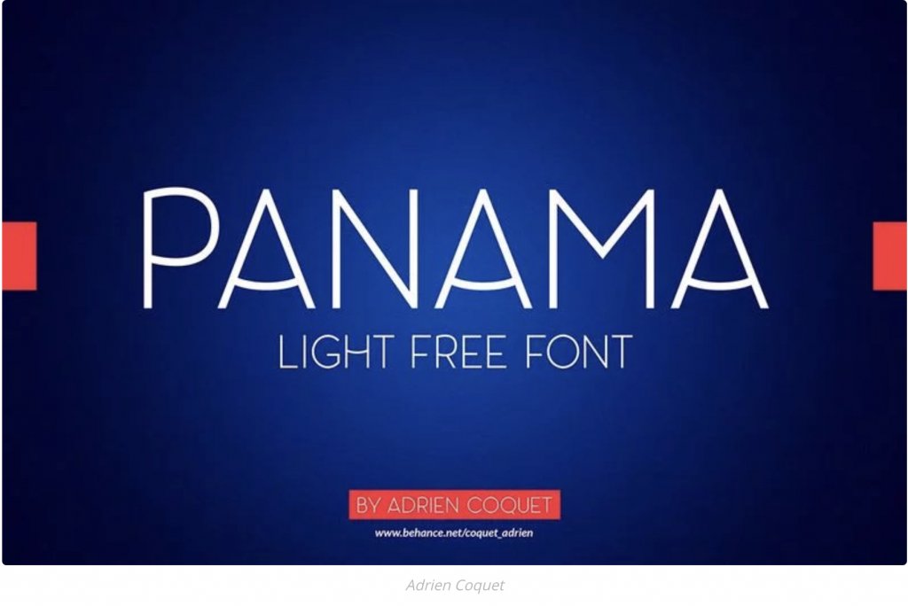
4. Prime by Max Pirsky (get it here)

5. Ahamono by Alfredo Marco Pradil (get it here)

6. Roboto free font by Google (get it here)

7. Uni Sans by Svet Simov, Ani Petrova & Vasil Stanev (get it here)

8. Titillium free font by Google (get it here)

9. Dense Regular by Charles Daoud (get it here)

10. Source Sans Pro free font by Google (get it here)

Conclusions
These above 10 free fonts will surely get you the help you need in in designing that poster, logo or website you’re working on, by not having to browse thousands of fonts all over the internet.

About the author: HIBRIDIUM is a freshly freelancer turned to brand project, aiming to offer, as already stated, “more than design”.